Next Generation Hospital Bratislava Slovakia
For a long time the capital of Slovakia has been looking forward to getting a new hospital facility. To have a broad and diverse choice of the design of the new hospital, Penta investments set out an international competition for the definition and design of the 70,000 m² building.
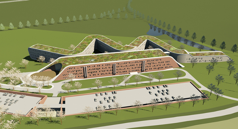
The strategically located site, which is situated next to the highway from Bratislava to the North, offered the opportunity to make the hospital very visible. This site also had tight planning restraints, especially regarding the limited building height. But the most challenging aspect in this case was to design a healing environment between a noisy highway on the one side and a busy shopping mall on the other side.
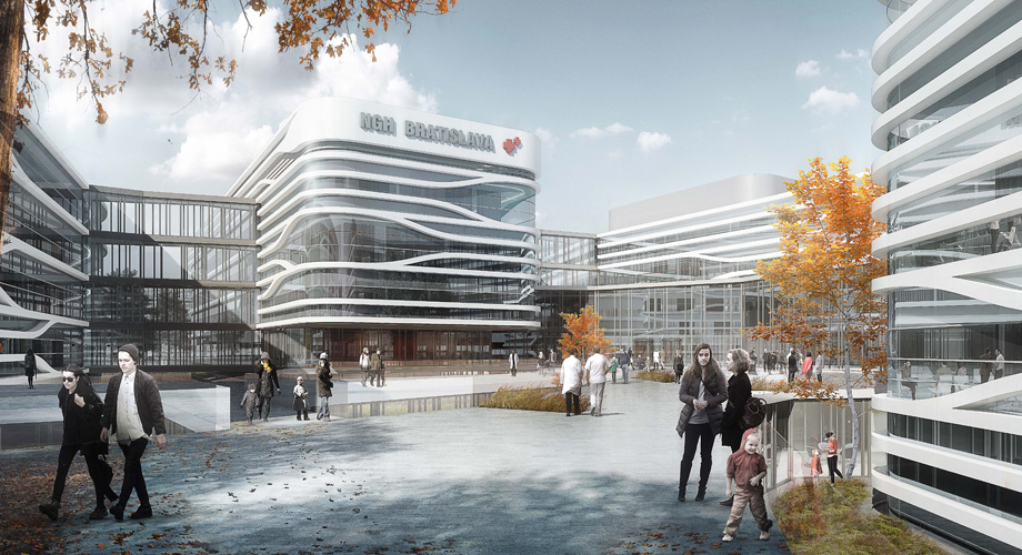
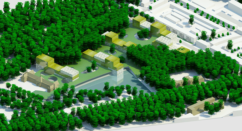
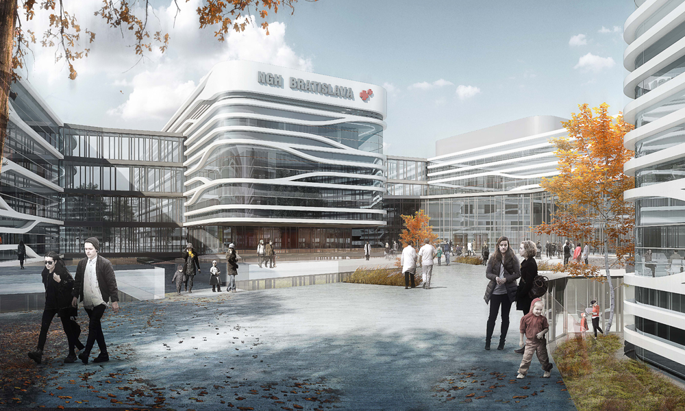
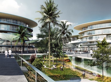
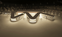
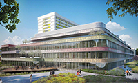
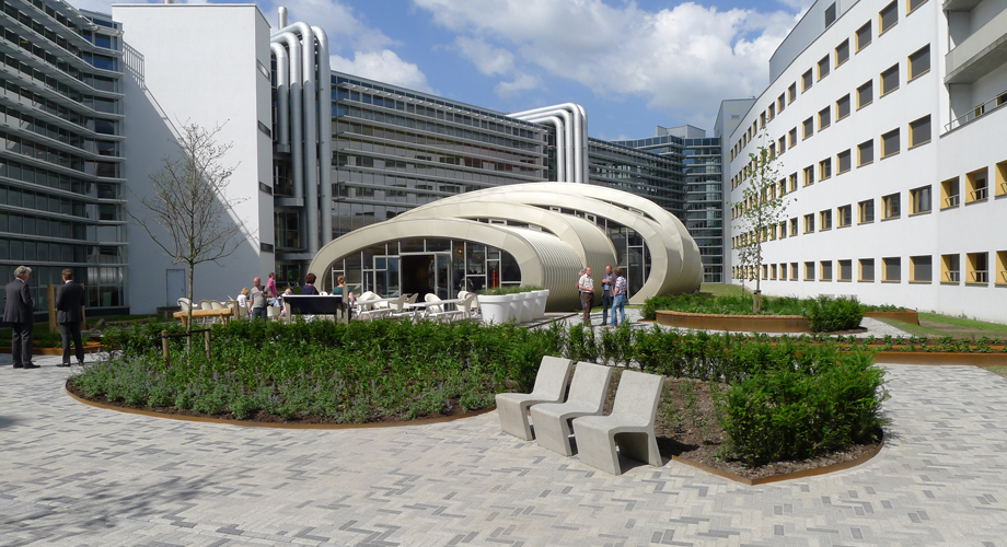
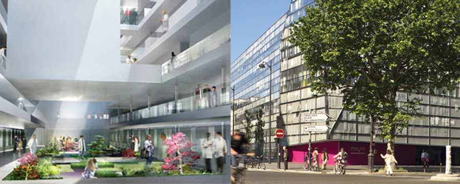
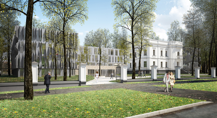
The solution Dutch Hospital Design choose to deal with this was to make a sound barrier which was made by the building itself. By stretching three relatively narrow building blocks into elongated volumes parallel to each other a quiet inner court was created. Narrow building blocks where natural daylight can penetrate deeply into the building are essential for creating the necessary flexibility. Essential connections were made by adding transparent cross volumes at two locations. Those cross streets at the same time protect the inner courts against a sometimes unpleasant Southerly wind.
Using the slope on the site two ground levels were created: a lower ground level and an upper ground level. This solution helps to provide penetration of natural daylight where necessary. It also offers a solution for the logistics, where the entrances are easy to find. The slope is also used to make double use of the surface area for parking while the keeping the costs low and the orientation is still easy.
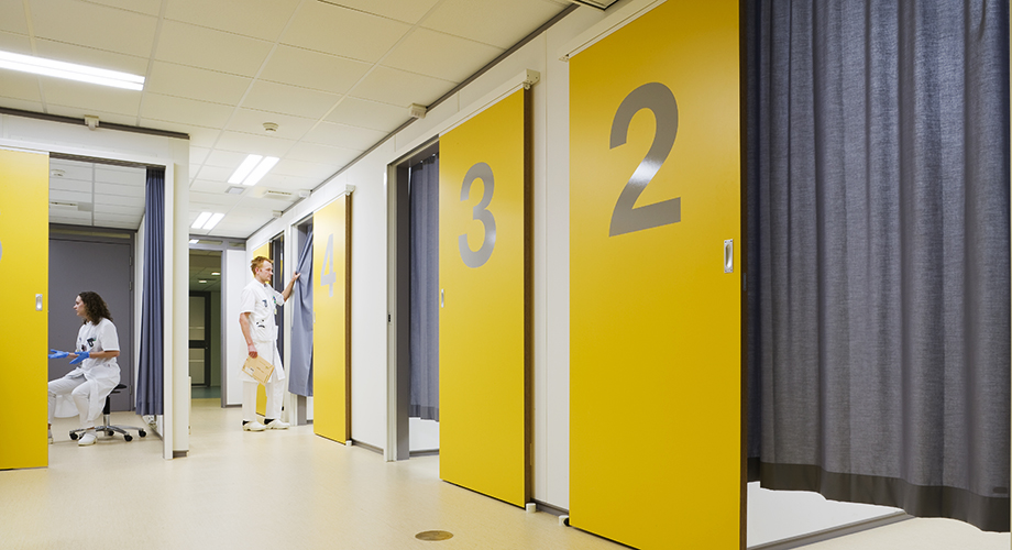
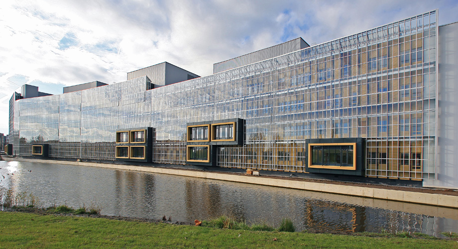
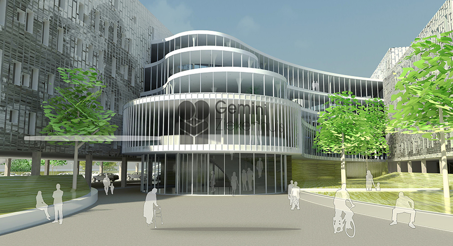
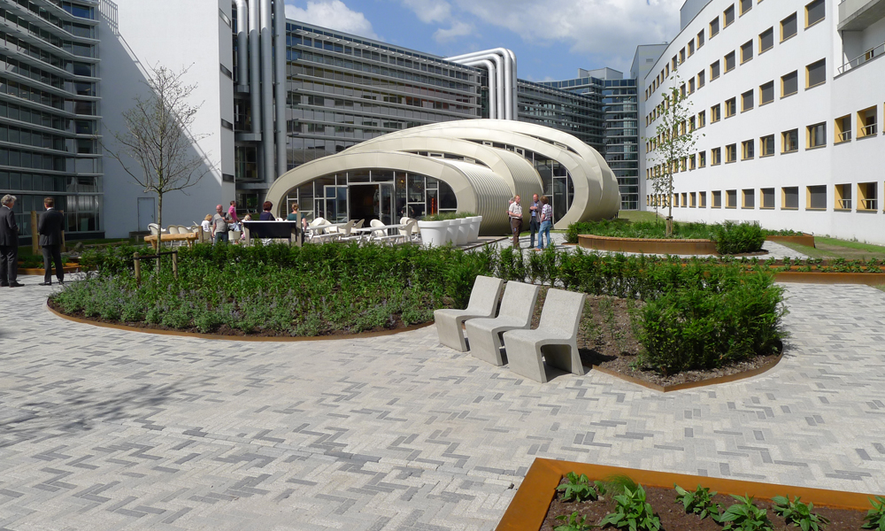
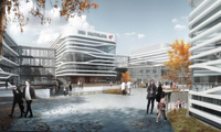
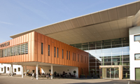
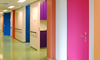
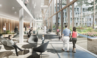
Architecturally the building can be seen as an icon on the way to or from Bratislava. The hospital design has a smart façade with an eye-catching feature using the bi gesture of dancing ribbons which adds a double layer in the façade. The simple curtain wall behind allows for freedom in the internal layouts on a fine design grid. The atmosphere inside the building is determined by a natural look and feel achieved by materials such as wood, natural stone and warm colours. In the beating heart of the building there is a strong connection between the different floors which is achieved by offering clear views of the stairs connecting each available floor, but also by offering views between the main connecting corridor and the inner courtyards.
